Container House Color Matching
The color matching of container houses requires comprehensive consideration of usage scenarios, style preferences, and color psychology. Here are specific matching plans and key points:

1. Industrial and Minimalist Style: Black + Natural Wood Color + Metallic Color
The exterior of the container is painted with smooth black paint, paired with a natural wood-colored interior. The sharp color contrast creates a visual impact, while metallic stairs and bright green decorative strips add vitality while retaining an industrial texture. This plan is suitable for young people pursuing individuality and modernity, especially for the design of standalone container houses in the suburbs.
2. Natural and Fresh Style: Brownish Wood Grain + Black Frame + Glass
The main body of the container adopts brownish wood grain panels, paired with black frames and transparent glass double doors, with black-framed double-opening small windows on both sides. The wooden deck connects with old stone floors, creating a harmonious feeling of 'growing out of the yard'. This color scheme is suitable for rural or scenic spots, balancing traditional charm with modern practicality.
3. Gentle and Healing Style: Cocoa Milk Color + Orange Peel Texture Paint
Low-saturation cocoa milk color is used as the main color, combined with matte orange peel texture paint to weaken the industrial attributes of the container and create a warm and healing atmosphere. The unified color scheme indoors and outdoors is suitable for overseas cultural tourism homestays, engineering camp dormitories, and other scenarios, especially those requiring humanistic care in emergency resettlement areas.
4. High-Contrast and Vibrant Style: Red-Blue/Pink-Blue Contrast + Geometric Elements
In cultural block renovations, designs such as red and yellow polka dots, pink-blue containers covered with roses, and yellow-green-blue patchwork beach houses create themed spaces like Pop Art, French flower houses, and seaside resorts through high-contrast color blocks and geometric elements. This plan requires artistic decorations such as graffiti and neon lights to enhance visual impact.
5. Classic and Timeless Style: All White + Transparent Glass
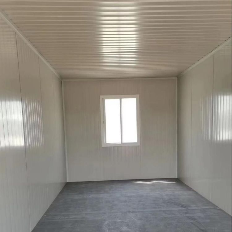
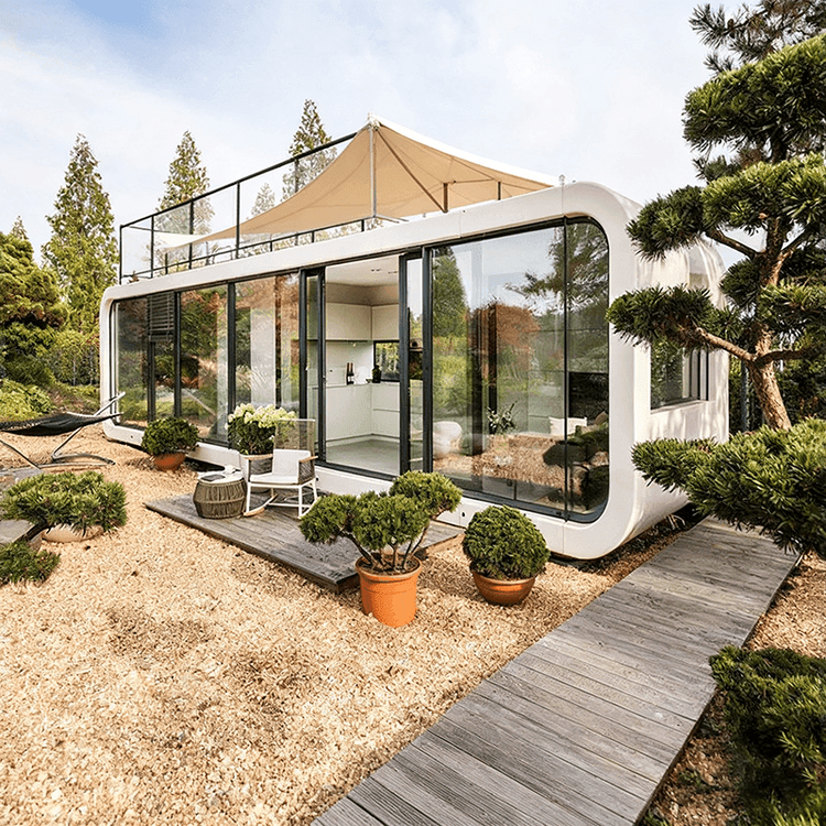
All-white container houses convey a sense of cleanliness through minimalist design, with large glass windows enhancing transparency, suitable for users pursuing minimalist aesthetics. White, as a neutral color, can be paired with any soft decoration style, offering high flexibility for later renovations. However, regular cleaning and maintenance are required.
Matching Principles:
- Scenario Adaptation: Durable color schemes are suitable for construction site dormitories, while vivid colors can be used for cultural tourism projects;
- Material Coordination: The matching of metal containers with wood, glass, and other materials should consider texture unity;
- Weather Resistance: Outdoor paints should have sun protection, rain protection, and fade resistance properties;
- Psychological Impact: Warm colors enhance warmth, cool colors enhance professionalism, and high-saturation colors stimulate vitality.