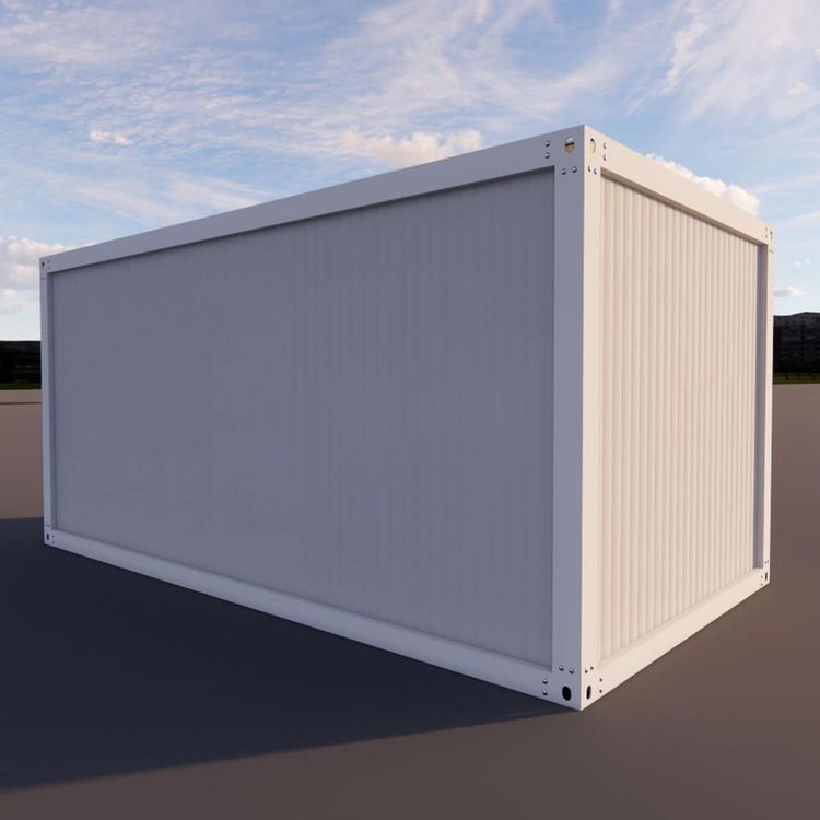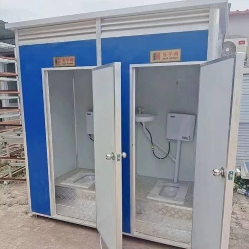
Mobile Toilet Tile Color Matching
The following options can be considered for mobile toilet tile color matching, which should be selected based on a combination of spatial characteristics, style preferences, and lighting conditions:

1. Morandi Color Scheme: Gentle, Healing, and Eye-Catching The Morandi color palette is characterized by low saturation and high gray tones, such as dusty pink, smog blue, and oatmeal. It creates a soft and sophisticated atmosphere. Its contrasting color designs (e.g., dusty pink walls paired with gray-green floor tiles) can break the monotony of traditional gray, white, and blue schemes, making them suitable for mobile toilets that seek uniqueness and a healing ambiance. This color scheme has low lighting requirements and does not appear oppressive even in small spaces, but care should be taken to avoid visual clutter caused by excessive color mixing.
2. Classic Color Schemes: Safe, Versatile, and Highly Adaptable
- White Series: As a “safe choice,” white tiles can reflect light, brighten the space, and visually expand the area, making them particularly suitable for small spaces or mobile toilets with insufficient lighting. Pure white walls paired with matte white floor tiles can create a minimalist style, but regular cleaning is required to prevent water stains from becoming visible.
- Gray Series: The combination of light gray walls and dark gray floor tiles is a classic pairing for modern minimalist styles, conveying a calm and composed atmosphere; industrial styles can be achieved through cement-textured gray tiles. Note that in small spaces, large areas of dark gray should be avoided as they can easily appear oppressive; balance can be achieved through local accents (e.g., dark gray waistlines).
3. Natural Color Schemes: Close to Nature, with Distinct Styles
- Beige/Light Coffee: Softer than white, beige tiles can create a warm atmosphere, suitable for Japanese or Nordic styles. Beige tiles paired with wooden elements (e.g., partitions, handrails) can enhance the natural feel, but moisture-proof treatment is required.
- Low-Saturation Green Series: Colors like mint green and gray-green have become popular in recent years and are suitable for mobile toilets with good lighting. Green walls paired with white fixtures can create a fresh feel, but the color ratio should be controlled (e.g., walls at 60%, floors at 30%) to avoid visual fatigue caused by excessive saturation.
4. Bold Contrasting Colors: Visual Focal Points, Style Enhancement
- Black and White Geometric Patterns: Checkerboard floor tiles paired with solid-colored walls are a hallmark of retro design, attracting attention through strong contrasts, but the pattern area should be controlled (e.g., used only on the floor) to avoid a cluttered appearance.
- Local Accent Colors: Using deep blue, Burgundy red, or other bold-colored tiles on a single wall within a white or gray base can create a visual focal point, suitable for artistic or personalized designs. Note that the accent color area should not exceed 20% of the wall, and it should coordinate with the overall style.