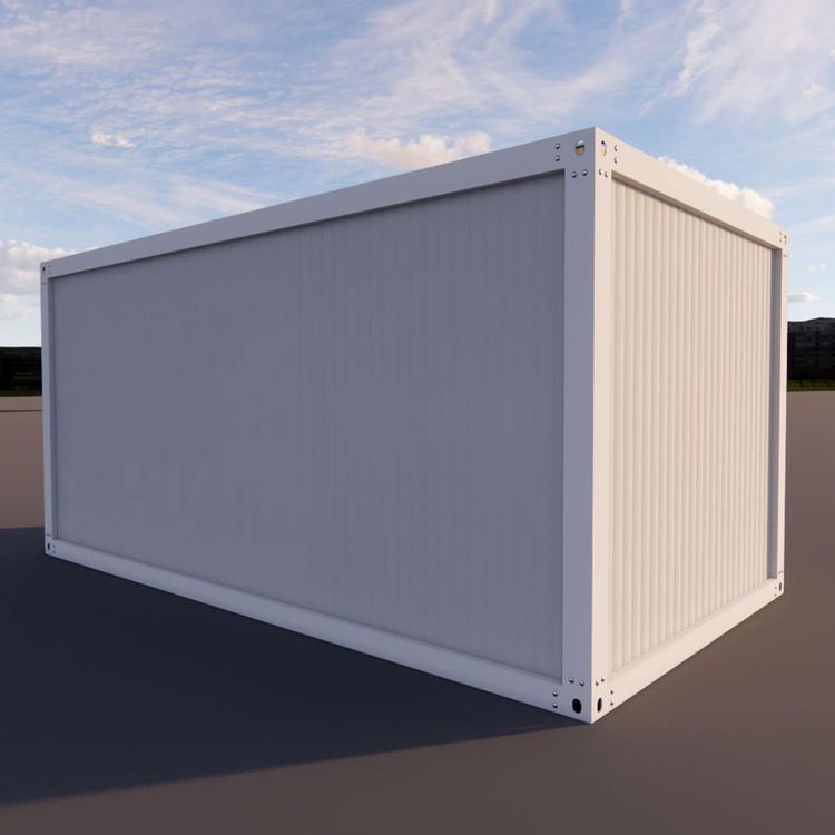
Container House Color Change Effect Diagram
Container houses offer a variety of color change effects, with common cases including pastel color schemes, Morandi color schemes, light gray combinations, and colored glass brick wall designs, each creating distinct visual impacts.
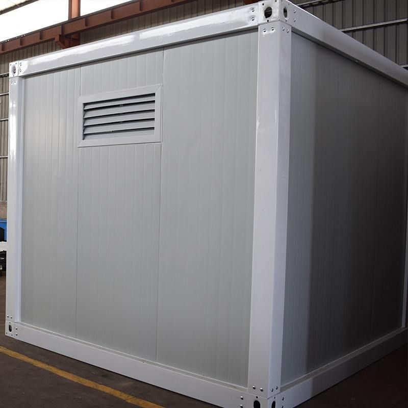
1. Pastel Color Scheme: Gentle and Healing Homestay Style
This color change primarily features low-saturation hues, with a typical example being a container homestay nestled among greenery. Its exterior walls are painted in a light white coating, paired with wooden decorative strips for a natural transition. The roof is covered with light gray waterproof tiles to enhance layering, and warm lights are hung along the edges to elevate the nighttime ambiance. Pastel colors soften the industrial feel of container houses through gentle tones, blending well with natural surroundings, making them suitable for creating leisure spaces such as homestays and cafes. For such color changes, attention should be paid to the weather resistance of the paint to prevent fading or peeling due to prolonged exposure.
2. Morandi Color Scheme: Balancing Sophistication and Artistry
The Morandi color scheme is based on gray tones, achieving a低调奢华 (understated luxury) visual effect by reducing color purity. Although specific case details are not provided, theoretically, such color changes can be applied to the exterior walls, door and window frames, or partial decorations of container houses. The advantage of the Morandi color scheme lies in its strong adaptability, preserving the rugged outline of industrial style while enhancing spatial texture through color harmony, making it suitable for high-end residences or creative office spaces. When implementing such color changes, attention should be paid to color proportions to avoid a压抑 (oppressive) atmosphere due to excessive gray tones.
3. Light Gray Combination: Fusion of Industrial and Modern Styles
Street-side container convenience stores often feature light gray metal exteriors, which, after polishing, reflect a soft luster, with rounded edges reducing the cold and hard feel. The light gray color change scheme emphasizes the original texture of metal materials while reinforcing the overall unity of the building through color consistency, making it suitable for commercial spaces or public facilities. Such color changes should be accompanied by rust-proof treatment to ensure long-term stability of the metal surface, and bright colors (such as signage) can be used for local embellishments to enhance visual appeal.
4. Colored Glass Brick Wall: Interaction of Light, Shadow, and Color
In one case, a container adopts a colored glass brick wall design, creating a three-dimensional canvas effect through light penetration. Although it is not clear whether this is an overall color change, it provides new ideas for container exterior innovation. Colored glass brick walls transform static buildings into dynamic art installations through color layering and light and shadow variations, making them suitable for cultural exhibition spaces or landmark buildings. When implementing, considerations should include the light transmittance, structural stability, and cost of glass bricks, as well as coordination with the surrounding environment to avoid excessive prominence.
Other common color change schemes include retaining the original metal texture or applying clear varnish to weld marks, emphasizing an industrial style presentation. Such designs reinforce mechanical aesthetics through exposed steel plates, bolts, and other elements, making them suitable for art studios, themed restaurants, and other settings. When changing colors, attention should be paid to surface cleaning and rust prevention, with regular maintenance to extend service life.