Mobile Toilet Design Color Matching
The color matching in mobile toilet design should take into account the scene attributes, visual psychology, and spatial hierarchy. Specifically, scientific choices can be made from the aspects of hue, brightness, and saturation, and functional and aesthetic balance can be achieved by combining with scenario-based adaptation cases.

I. Hue Selection: Matching Color Attributes Based on Scene Attributes
Hue is the foundation of color matching and requires the selection of a dominant color based on the functional positioning of the usage scenario.
- Warm tones (red, orange, yellow): Convey a sense of vitality and warmth, suitable for crowded scenarios such as exhibitions and amusement parks. For example, mobile toilets at music festivals or art exhibitions can create a cheerful atmosphere with high-saturation warm colors like bright yellow and vivid orange, attracting crowds and enhancing scene memorability.
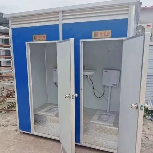
- Cool tones (blue, green, purple): Highlight a sense of calmness and cleanliness, suitable for business spaces, parks, and areas around office buildings. For example, the mobile public restroom on Century Avenue in Weifang Road uses light beige and light brown as the base, with dark blue outlining the borders, maintaining a professional feel while reducing visual pressure through cool tones.
- Neutral tones (black, white, gray, beige): As basic harmonizing colors, they can independently create a minimalist and sophisticated feel or be combined with other colors to reduce harshness. The mobile toilets in Zhengzhou adopt a Morandi color scheme, enhancing individual appeal and avoiding color conflicts through gentle and healing color clashes.
II. Brightness Matching: Building Spatial Hierarchy Through Light-Dark Contrast
Brightness matching should follow the principle of "light on top, dark on the bottom" to optimize spatial visual experience.
- Upper space: Areas such as ceilings and upper walls should use high-brightness colors (such as white, light gray, beige) to enhance lighting and expand spatial perception. For example, the gray and white combination with metal carved panels in conventional mobile toilets achieves a balance between simplicity and practicality through differences in color brightness.
- Lower space: Areas such as floors, sink cabinets, and lower walls should adopt medium to low-brightness colors (such as dark gray, light brown, dark green), which are not only dirt-resistant and easy to clean but also create a stable visual focus through light-dark contrast, avoiding the imbalance of being top-heavy.
III. Saturation Control: Balancing Visual Impact and Comfort
Saturation directly affects the visual impact of colors and requires control of usage proportions based on scene needs.
- High-saturation colors: Such as bright yellow, vivid orange, and royal blue, are suitable for creating check-in points or scenarios that highlight individuality (such as music festivals and art exhibitions), but their usage area should be controlled (such as for local decorations or accent colors) to avoid visual fatigue from large-area use.
- Medium to low-saturation colors: Such as Morandi colors, macaron colors, and earth tones, are gentle and understated, suitable for scenarios pursuing simplicity and comfort (such as commercial centers and parks). For example, the upgraded mobile public restrooms achieve a natural integration into the urban environment and make users feel relaxed through a low-saturation combination of light beige, light brown, and dark blue.
IV. Scenario-Based Adaptation Cases
- Crowded scenarios: Mobile toilets at exhibitions or amusement parks can use a combination of warm tones and high-saturation colors, such as orange walls paired with yellow decorative strips, to enhance the lively atmosphere.
- Business/park scenarios: Mobile toilets around office buildings or in parks should adopt a combination of cool tones and neutral tones, such as light gray walls paired with dark blue borders, to highlight professionalism and cleanliness.
- Community/street scenarios: The gray and white color scheme or Morandi color scheme (such as light pink and light green) of conventional mobile toilets balances practicality and aesthetics through low saturation and neutral tones, blending into the daily environment.