Drawing Method for Mobile Toilet Advertising
The drawing method for mobile toilet advertising can be completed by combining hand-drawn customization, style references, and basic logo design. The specific steps are as follows:
1. Clarify Requirements and Scene Adaptation
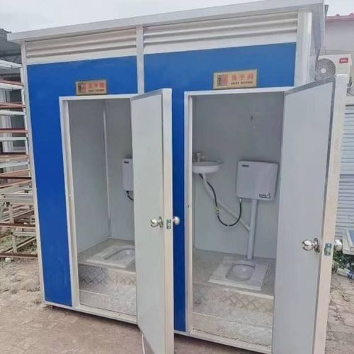
Determine the core function of the advertisement based on the actual structure of the mobile toilet (such as single-squat, multi-squat, with a sink, etc.) and the placement scenario (scenic spots, construction sites, event venues, etc.). For example, if it is a toilet in a scenic spot, the advertisement can focus on cultural promotion; if it is at an event venue, it can highlight convenience or brand exposure. Refer to the hand-drawn customization case of Dezhou Hongtu Metal Products Co., Ltd., which combines functionality and aesthetics through a layout design of a "two-squat apple-shaped toilet + public sink," and the advertising drawing method should prioritize matching such structural characteristics.
2. Choose Style and Color Scheme
The advertising style should match the target audience. Common styles include:
- Blue Minimalist Style: Suitable for public places, such as blue public toilet directional signs, which convey a clean and professional impression through cool tones and are suitable for pairing with white text or icons.
- Cartoon Style: Suitable for children's activity areas or parent-child scenarios, such as yellow cartoon posters focusing on toilet culture, which attract attention with exaggerated shapes and bright colors and can include fun slogans (such as "Small Toilet, Big Civilization").
- Hand-drawn Custom Style: Designed one-on-one according to customer needs, such as drawing the toilet exterior as fruits or animals to enhance memorability.
3. Basic Logo Design Method
If you need to draw basic graphics such as gender logos, you can refer to simple drawing tutorials:
- Male Logo: Use a circle as the head, the letter "N" to represent a bow tie, and combine triangles and curves below to form the outline of pants.
- Female Logo: Also use a circle as the head, draw long hair or a bow with curves, and combine inverted triangles and curves below to form the outline of a skirt.
The logos should be clearly distinguishable, and it is recommended that the size be no less than 10cm×10cm to avoid excessive details that make it difficult to identify from a distance.
4. Integrate Elements and Layout
When integrating style, color scheme, and logos, follow the principle of "clear priorities":
- Place core information (such as "Toilet" and "Male/Female") at the visual center, accounting for about 60%;
- Place auxiliary information (such as directional arrows and brand logos) at the edges, accounting for about 30%;
- Use decorative elements (such as cartoon patterns and patterns) as embellishments, accounting for about 10%.
For example, a blue minimalist advertisement can place the directional sign at the top, the gender logos in the center, and decorate the bottom with light blue wavy lines; a cartoon-style advertisement can use cartoon characters as the main body and integrate gender logos into the characters' clothing.
5. Verification and Adjustment
After completing the initial draft, verify it from the following perspectives:
- Functionality: Are the logos clear? Is the directional indication accurate?
- Aesthetics: Is the color scheme coordinated? Is the style unified?
- Applicability: Does it adapt to different lighting conditions (such as the need for nighttime reflectivity)? Is it wear-resistant (such as considering materials for outdoor advertisements)?
Adjust the details based on feedback to ultimately form an advertisement design that meets the requirements and has communication power.