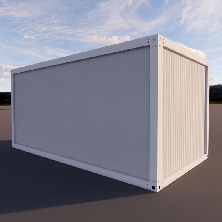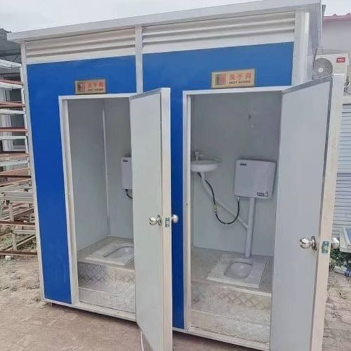
Container House Color Scheme Table
Currently, there is no directly available color scheme table for container houses, but common color schemes can be summarized based on actual cases:

I. Classic Industrial Style Color Scheme Focusing on the original metallic texture of containers, it retains silver-gray or dark-gray corrugated steel plates as the main color tones, paired with black metal frames and transparent glass. For example, the "Wolferlow Cabin" in Manitoba, Canada, creates a contrast by retaining the original color of the container and the black supporting structure, reflecting industrial aesthetics. This color scheme is suitable for outdoor camping, art parks, and other scenarios, emphasizing the mechanical and modern feel of the building itself.
II. Nature-Integrated Color Scheme This scheme combines earthy color tones with container structures and is commonly seen in rural or forest settings. For instance, in the case of a four-person family in a Jiangsu town, the exterior walls of the container are painted light brown or off-white, paired with wooden decks and green vegetation to soften the cold feel of the metal. The 9-container residence of a Danish man integrates the building into the Nordic natural environment through white exterior walls and large glass windows, while retaining the corrugated metal interior walls as decorative elements.
III. High-Contrast Vibrant Color Scheme For commercial or homestay scenarios, bright colors are used to enhance visual appeal. For example, a 100-square-meter bungalow mansion in Costa Rica features a dark blue base for the container exterior walls, paired with bright yellow door and window frames; a container hotel in China uses bright blue paint as the main color, complemented by full-glass sliding walls to create a beach resort style. For such color schemes, attention should be paid to controlling color proportions, typically following the principle of 70% base color + 25% auxiliary color + 5% accent color.
IV. Minimalist Monochromatic Scheme This scheme creates a sense of sophistication through a single color tone and is commonly seen in high-end custom projects. For example, in a 18-square-meter container renovation case, the exterior uses matte black metal plates, while the interior features white walls paired with natural wood furniture, forming a classic combination of "black-white-wood". Such designs require attention to the contrast in material textures, such as the combination of metal, glass, and fabrics.
Key Points for Color Scheme Design:
- Environmental Adaptability: Coastal areas should use corrosion-resistant fluorocarbon paints, while desert environments require high-reflectivity light colors;
- Functional Zoning: Residential containers are recommended to use warm colors (off-white, light gray), while office containers can adopt cool colors (dark blue, silver gray);
- Maintenance Costs: Dark colors tend to show dust more easily, while light colors require regular cleaning. For industrial sites, it is advisable to choose dirt-resistant gray tones.