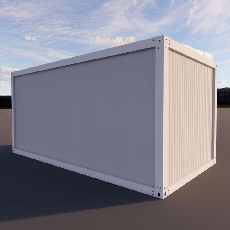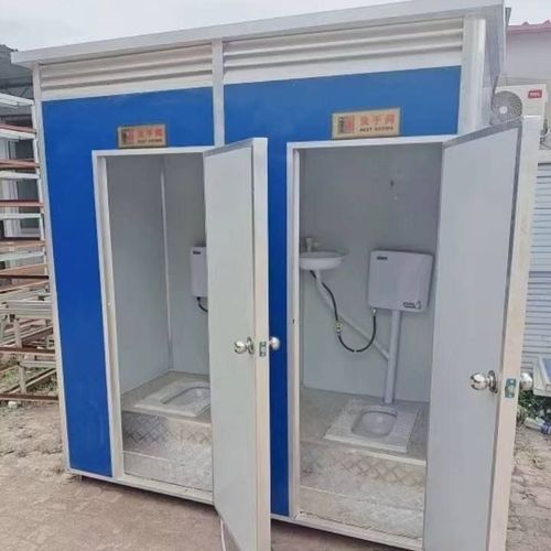
Container House Color Renderings
Container houses come in a variety of color effects. Here are some typical cases and descriptions for reference:
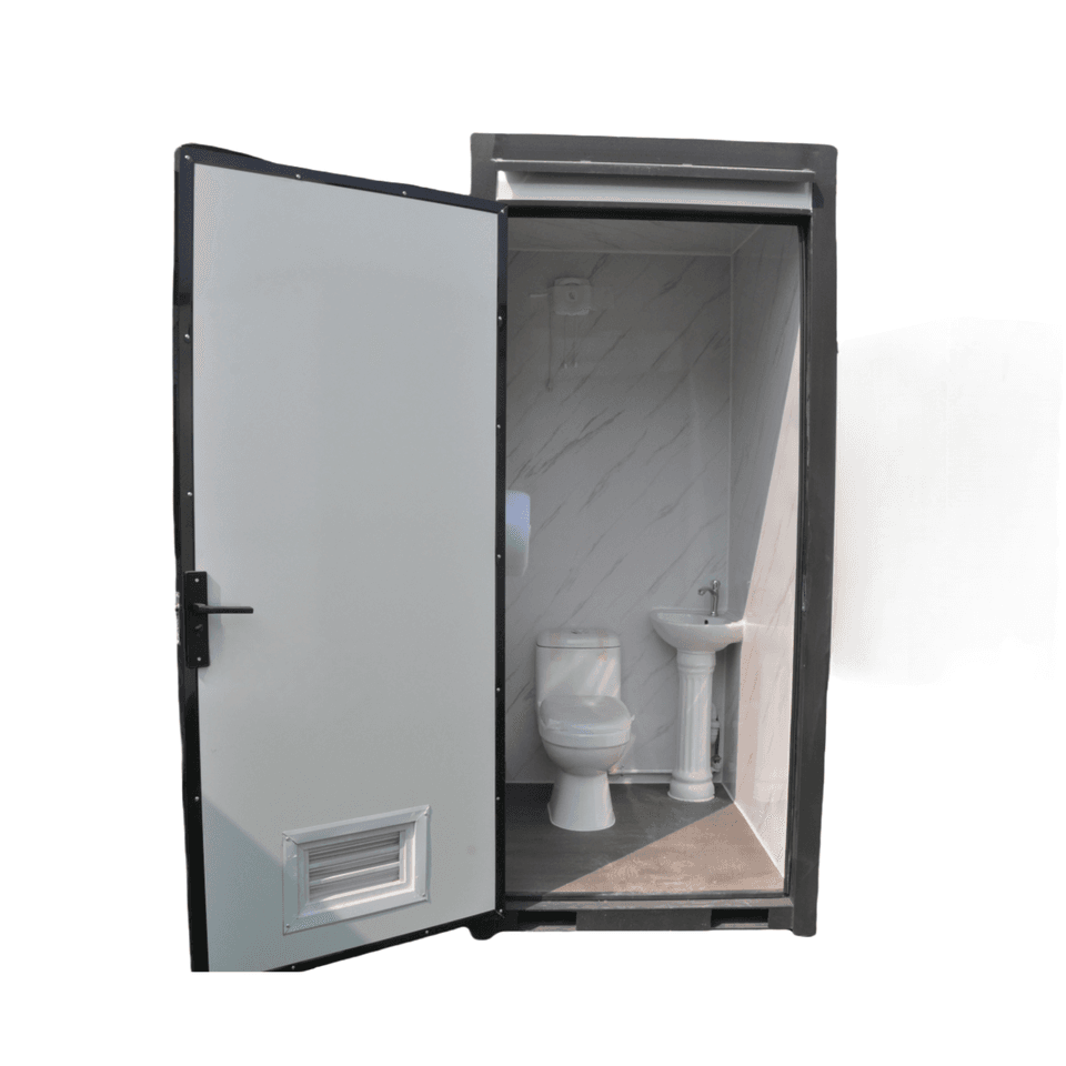
1. Blue tones: A fusion of modern and industrial styles
The "Quartz Cottage" in Cornwall, UK, features a bold blue as its primary color. The exposed corrugated steel contrasts with glass doors and windows, preserving the industrial texture of the container while giving it a modern feel through the use of blue. Light blue finishes offer a fresher look, such as in some camping guesthouses that use light blue containers paired with wooden decorations to create a relaxed atmosphere that combines nature and industry. Blue tones are suitable for scenarios that pursue simplicity, a technological feel, or integration with the natural environment.
2. Red and blue contrast: Balancing vitality and transparency
Container hotels adopt a red and blue contrast design, where red containers and blue decorative lines create a visual impact. Large glass windows are used to enhance transparency, while wooden elements are incorporated to soften the industrial feel. This color scheme is suitable for commercial spaces or public buildings, as it can attract attention while improving comfort through material contrasts.
3. Pink and minimalism: Creative expressions that break conventions
Weekend retreats feature pink speckled facades and minimalist interior designs, with adjustable stairs connecting the upper and lower floors. Pink containers break away from the cold and hard impression of traditional industrial buildings and are suitable for personalized and artistic living or leisure spaces, especially popular among young people.
4. Vibrant colors and green environments: Youthful and energetic spaces
Some container buildings use vivid colors (such as bright yellow and orange-red) paired with green vegetation to create a striking contrast. For example, containers with retractable doors can extend living spaces, serving as social or event venues. This color scheme is suitable for community centers, creative parks, and other scenarios, conveying an open and inclusive youthful atmosphere.
5. Metal original colors and contrasting designs: Balancing preservation and innovation
Some cases retain the original metal color of the containers, pairing them with materials like glass and wood to highlight the industrial texture. Other cases adopt personalized contrasting designs (such as the "amazing" color scheme of a double-decker container house), showcasing unique aesthetics through color collisions. Metal original colors are suitable for projects pursuing minimalist or vintage styles, while contrasting designs are more applicable to art installations or iconic buildings.
Tips for obtaining renderings:
If you need specific color renderings, you can refer to case displays on container architecture platforms (such as Container Home Plans, Boxman Studios) or design websites (such as ArchDaily, Pinterest). These platforms usually provide high-definition images and detailed design descriptions.