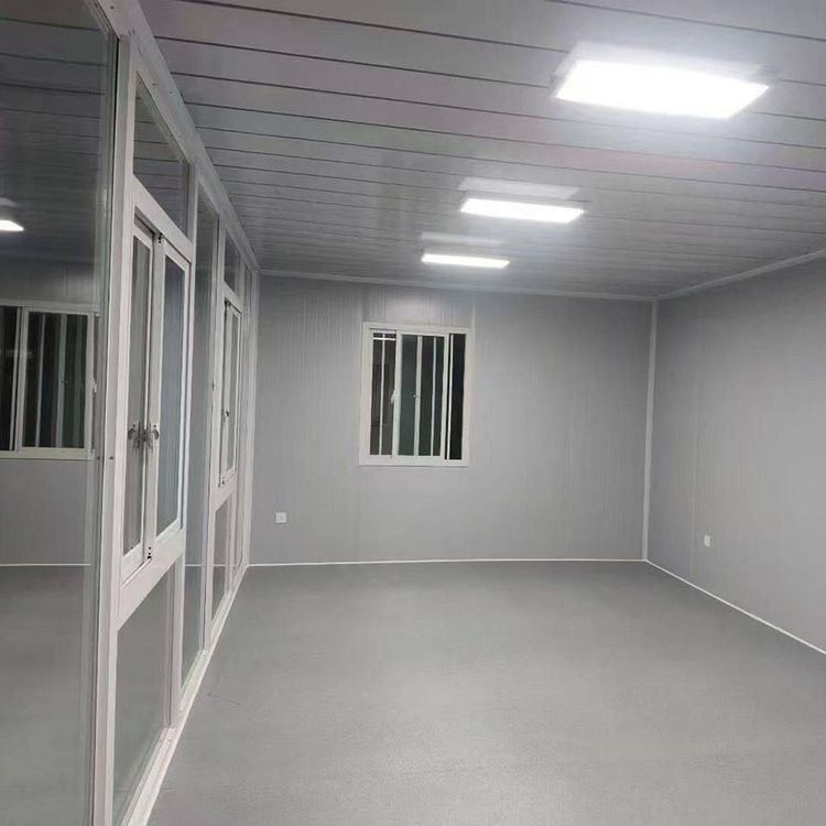
Mobile Toilet Logo Design
Mobile toilet logo design can focus on reflecting mobility, toilet attributes, and modern style. Below are specific design directions and key points:

I. Selection of Core Design Elements The "mobility" of mobile toilets is a key feature, and structural elements such as trailers and carriages can be prioritized as the basis for graphic design. For example, a simplified outline of a mobile toilet trailer can be used as the main body, with lines勾勒 (translated as "outlining") the rectangular structure of the carriage and adding wheel symbols at the bottom to emphasize mobility. Alternatively, dynamic lines can be used to represent the trajectory of movement, such as arcs extending outward from the main body, suggesting the toilet's mobility. Toilet attributes can draw inspiration from universal signage materials, such as the classic symbols for men's and women's toilets (circles for women, triangles for men), or use concrete graphics like toilets or urinals, but these should be abstracted to avoid being overly literal. For instance, the outline of a toilet can be simplified into geometric lines and combined with mobile structures to form a unique logo.
II. Color Matching Strategy Colors should balance visibility with industry attributes. Blue is a common exterior color for mobile toilets (e.g., blue portable toilets) and can serve as the primary color to convey a clean and professional impression. Green (e.g., composting toilets) is suitable for emphasizing environmental protection concepts, paired with white or light gray to enhance a modern feel. If the goal is a minimalist and stylish look, a combination of off-white and orange (e.g., modern renovation-style mobile public toilet cases) can be referenced, with low-saturation off-white as the base color and orange as an accent color to highlight key elements (such as wheels or logo symbols), creating a visual focal point. Avoid using too many high-saturation colors to prevent a cluttered appearance.
III. Style and Composition Design A minimalist and stylish approach is an effective way to enhance recognizability. Composition can adopt a central symmetry or golden ratio layout, placing the core graphic (such as the trailer outline) at the visual center, with auxiliary elements (such as dynamic lines or logo symbols) symmetrically distributed or extending along diagonals to enhance balance. Graphic processing should be simplified, such as using single lines to outline the trailer structure and omitting details like doors and windows. Logo symbols can be minimized and placed in the corners of the graphic to avoid overpowering the main design. Font selection is also crucial; sans-serif fonts (such as Helvetica, Arial) are more in line with modern aesthetics, and the font size should be coordinated with the graphic proportions to ensure overall simplicity and clarity.
IV. Creative Fusion Directions Attempts can be made to combine functional attributes with artistic expression. For example, the arc of the movement trajectory can be designed as a leaf shape, suggesting an environmental protection concept. Alternatively, an abstracted "urinal" graphic can be embedded within the trailer outline, forming a hidden symbol through negative space to add design depth. If the target users are in public places, regional cultural elements (such as local characteristic patterns) can be incorporated to enhance affinity. If targeting the environmental protection sector, green elements can be reinforced and circular arrow symbols added to highlight sustainability.
You may also like
Portable Toilet Color Steel Custom & OEM: Design & Bulk Production Guide
Read More
Portable Toilet Color Steel: Top Options & Considerations
Read More
Portable Toilet Color Steel Explained: How to Choose the Right One
Read More