Mobile Restroom Toilet Colors
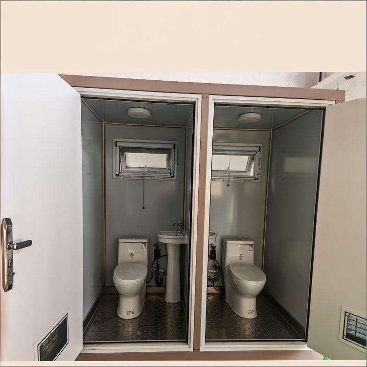
The toilet colors of mobile restrooms are quite diverse, with common combinations including gray and white, light beige and light brown as the base paired with dark blue, and gray, blue, and red, among others.

Gray and White Combination
The gray and white combination is a classic and common color scheme for mobile restrooms. White gives a feeling of cleanliness, tidiness, and brightness, creating a refreshing visual effect and preventing users from feeling压抑 when entering the restroom. Gray, on the other hand, has a stable and understated quality. When paired with white, it not only prevents the overall look from being too monotonous but also adds a sense of solemnity. This color scheme is suitable for mobile restrooms in various settings, whether it's public places like parks and scenic spots or temporary event venues. It can blend well with the environment and give people a psychological hint of good hygiene conditions.
Light Beige and Light Brown as the Base Paired with Dark Blue
Using light beige and light brown as the base colors can create a warm and comfortable atmosphere. Light beige is soft and warm, while light brown has a natural and rustic feel. Their combination makes people feel like they are in a cozy little space. The addition of dark blue adds depth and solemnity to the entire restroom, breaking the monotony that light colors might bring. This color scheme is relatively common in mobile restrooms at high-end event venues or those with high requirements for the environmental atmosphere, enhancing the user experience.
Gray, Blue, and Red Combination
The combination of gray, blue, and red is relatively lively and unique. Gray still plays a role in stabilizing the overall color tone, blue brings a fresh and tranquil feeling, and red serves as an accent color, adding vitality and enthusiasm to the entire restroom. This color scheme may be adopted in mobile restrooms at themed events or creative venues, attracting people's attention and showcasing a unique personality. However, since red is quite bright, it is necessary to control its proportion during use to avoid being too glaring and affecting the user experience.