House Design Explained: How to Choose the Right One
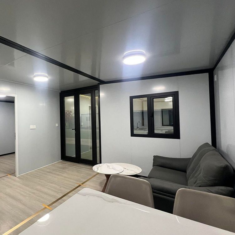
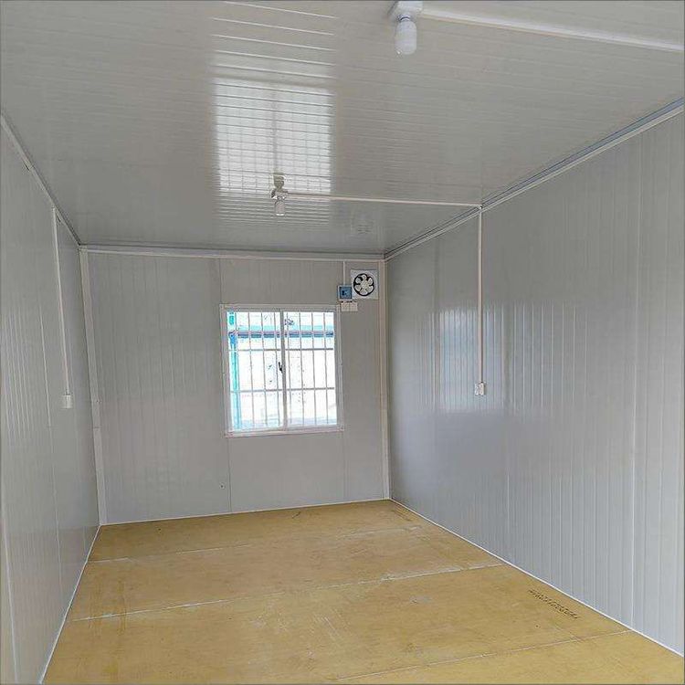
Choosing the right house design (especially for the color scheme of the living room) requires a comprehensive consideration of theme inspiration, color schemes, the use of contrasting colors, and color sample testing.

1. Determine Theme Inspiration and Ideal Style
The core of house design is to clarify the overall style direction. As the central area of the space, the color scheme of the living room should align with the overall theme. Start by visualizing the ideal room in your mind, such as choosing a beach theme (dominated by blue, white, and sandy colors), bohemian style (blending warm tones with ethnic patterns), vintage style (dark brown and forest green paired with metallic elements), classic style (neutral colors and symmetrical layouts), or rustic style (off-white, light wood tones, and natural textures). Theme inspiration provides a clear framework for color selection, preventing design chaos.
2. Select Appropriate Colors and Tones
Based on the theme direction, choose matching color combinations. For example, a beach theme can use light blue, off-white, and light gray; vintage style suits deep red, forest green, and gold. Pay attention to the brightness and saturation of colors: high brightness (such as light pink and pale yellow) is suitable for small spaces or areas with insufficient lighting, enhancing a sense of openness; low brightness (such as dark brown and navy blue) is ideal for large spaces or scenes requiring a calm atmosphere.
3. Master Basic Color Scheme Techniques
When communicating with interior designers, refer to the following color principles:
- Monochromatic Scheme: Focus on a single color, creating a sense of layering through variations in shade (such as light gray, medium gray, and dark gray), suitable for spaces pursuing simplicity or minimalism.
- Complementary Color Scheme: Choose colors opposite each other on the color wheel (such as blue and orange, red and green) to enhance visual impact through contrast, but control the ratio (usually the main color accounts for 70%, and the secondary color accounts for 30%) to avoid excessive harshness.
- Analogous Color Scheme: Select colors adjacent to each other on the color wheel (such as blue, blue-green, and green) to create a harmonious and unified atmosphere, suitable for natural or tranquil-themed designs.
4. Flexibly Use Contrasting Colors to Enliven the Space
If you prefer neutral tones (such as beige, gray, and white), you can break the monotony with local contrasting colors. For example, use deep blue, forest green, or brick red on the ceiling or a single solid wall to contrast with neutral-colored walls, highlighting the focal point of the space without disrupting overall harmony.
5. Conduct Color Sample Testing to Verify Effects
The actual effect of colors on walls may differ from color swatches, significantly influenced by lighting and material. It is recommended to paint a small area on the wall (such as a corner) with the color sample before large-scale painting, observing its performance under different times of day (daytime and nighttime) and lighting conditions to avoid rework due to color differences, saving time and costs.