Container House Portfolio Cover Design
The design of the cover for a container house portfolio should integrate the general design principles of architectural portfolios with the unique characteristics of container houses. The following ideas can be referenced for creation:

1. Cover Theme and Style Positioning The core features of container houses are modularity, industrial aesthetics, and sustainability. The cover design should revolve around these keywords. Styles can include minimalism (highlighting geometric lines and structural sense), futurism (expressing a sense of technology through light and shadow or abstract elements), or eco-themes (incorporating natural elements such as greenery and sunlight to emphasize environmental protection concepts). For example, using the three-dimensional grid of a container as the background, paired with low-saturation industrial gray or eco-friendly green as the main color tones, can reflect professionalism while aligning with industry trends.
2. Selection and Combination of Visual Elements
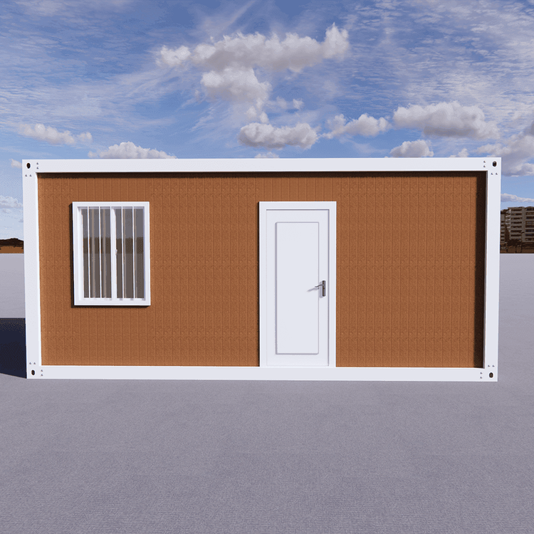
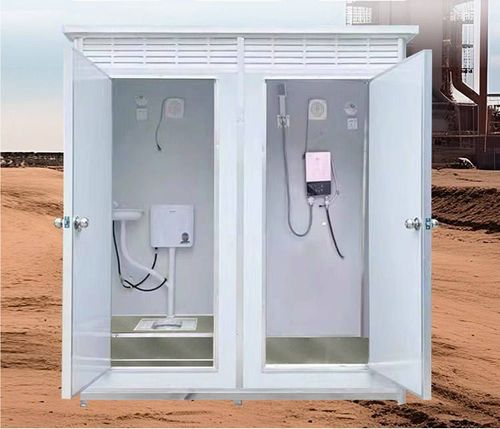
- Main Graphics: You can directly use 3D models or line drawings of containers as the core visuals, showcasing internal structures through perspective or exploded views; or abstract them into geometric module assemblies, symbolizing design flexibility.
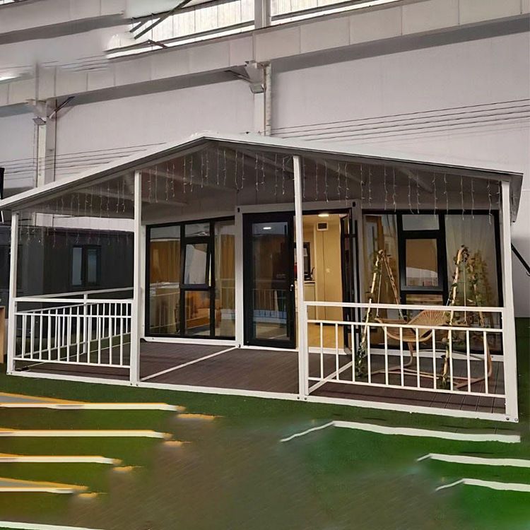
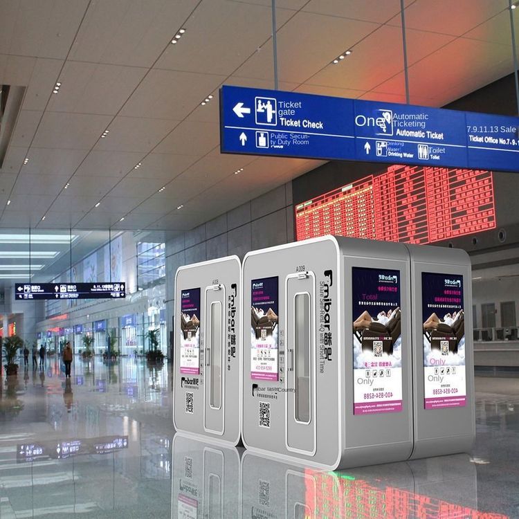
- Supporting Elements: You can add city skylines, natural landscapes, or human silhouettes to suggest the application scenarios of container houses (such as temporary housing, commercial spaces, or post-disaster reconstruction). If the portfolio includes actual projects, you can extract iconic elements from the projects (such as special materials or color schemes) for simplified design.
- Text Layout: The title (such as 'Container House Design Collection') should stand out. It is recommended to use sans-serif fonts (such as Helvetica or Arial) to enhance a modern feel; subtitles or author information can be reduced in size and placed in corners or at the bottom to maintain visual balance.
3. Metaphors of Color and Material
- Color: Industrial styles often use silver-gray, dark blue, or rusty red, while eco-themes can choose wood tones, light gray, or matcha green. Avoid using too many high-saturation colors to prevent weakening the professional feel.
- Material: You can simulate the metallic texture of containers (such as matte or brushed effects) or eco-friendly materials (such as the granular feel of bamboo fiber or recycled plastic) through textures to enhance visual layers.
4. Reference Cases and Inspiration Sources You can draw inspiration from general templates for architectural portfolio covers (such as grid layouts or white space designs), but replace them with container-related elements. For example, one design agency once used a cross-section of a container as the background, overlaying semi-transparent project photos to showcase both structure and practical application; another case used dynamic lines connecting multiple container modules to symbolize the systematic nature of the design process.
5. Precautions
- Avoid excessive complexity: The cover should convey core information within 3 seconds; too many elements can appear cluttered.
- Maintain consistency: If the inner pages of the portfolio have fixed color schemes or graphic styles, the cover should echo them.
- Test printing effects: Metallic or dark backgrounds may appear dirty when printed; adjust color values in advance.